Google’s search results have a new ‘flashcards’ look
Don’t worry, you’re not the only one seeing a new layout for Google’s search results.
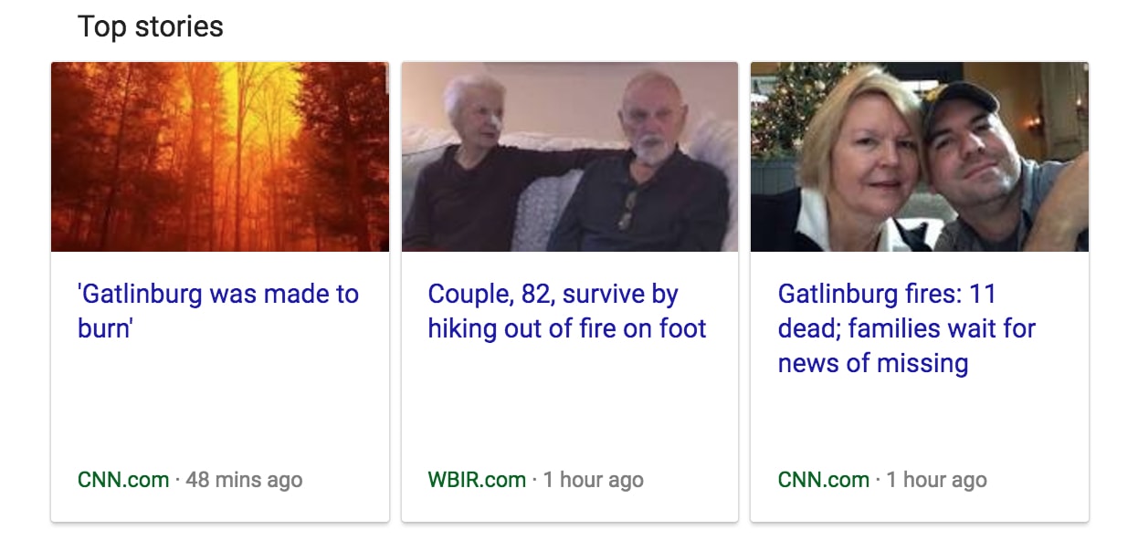
Google has categorized news items into a ‘Top News’ bar within the search results. Users can click on a link below the news items to see Google News results for the search query. Additionally, Google is giving Twitter the same flashcard treatment, featuring the latest Tweets in the row of three flashcards.
Playing up tweets in search results can be traced back to the Google-Twitter partnership in 2015, which gave the search giant access to Twitter’s firehose of news.
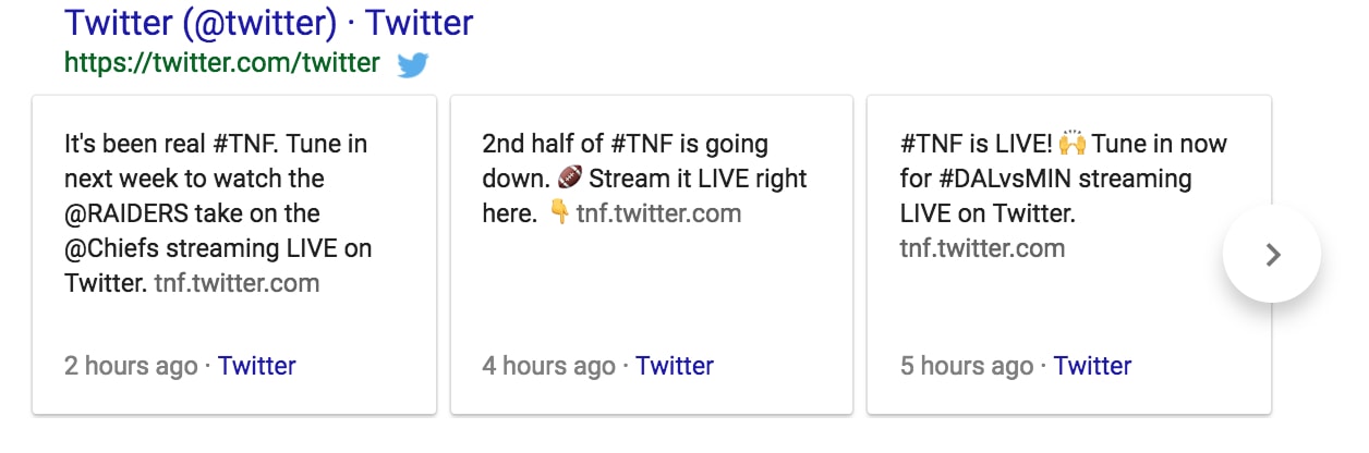
Twitter also got the ‘flashcards’ treatment
This isn’t the first time Google has revamped its look. Google started testing out a Material Design in June, which is a visual template that categorizes search results by type of information like newsbites or official channels, the Verge reported. At the time, Google also moved its Knowledge Graph results – the data that appears as short encyclopedic blurbs – from the side of the screen to the body of the search results.
An observant Redditor by the username nightandtodaypizza posted a screenshot of the new results at 7 p.m. Commenter pmatdacat noted that the update was similar to the Material Design of Android phones, which uses card-styled results. However, the desktop version is missing the mobile’s carousel, which means you can’t flip through news items without clicking on the ‘More news’ link.
According to Gadgetsreview.com, the Google Play Store was also given a new design as well as new transitions. In addition to sporting a new shade of green, the Play Store’s app results will open in a card instead of a full screen, reports Gadgetsreview.com. You can also swipe between apps.
It is not clear yet whether Google is just testing out the design tweaks or rolling them out.