Getty Boston Red Sox City Connect Uniforms
You know how those folks at Major League Baseball roll. They’re always looking to tweak something and keep the brand relevant in an ever-changing sports landscape.
For this reason, MLB decided to bring Nike into the uniform mix in 2020. At the presser, a semi-gushing MLB Commissioner Rob Manfred made it known that Nike is a”global brand” with a desirable “reputation as a leader in driving innovation,” per MLB.com
Strangely, Nike partnered with Fanatics—a company with a great deal of unwanted notoriety—in a 10-year Swooshified deal worth over $1 billion. Each MLB team will garner around $3 million per year in piggy bank money. No revenue stream shall go unturned!
In essence, Nike slapped on a Swoosh while Fantatics rolled out the merchandise.
In a corresponding effort to link a particular city’s historical and cultural nuance to its MLB product, in 2021, the “City Connect” uniform concept came to fruition.
Fast forward to 2024, and here are my three best and worst attempts at nailing the preconception amid a rocky road of controversy and social media revilement.
Fanatics’ Reputation, Uniform Quality & Appeasing a Fanbase
The City Connect effort has burgeoned from just seven participating teams in 2021 to a nearly full field of 28 franchises as of June 2024.
Along with their consorting of traditional uniform designs, the tenure between Nike/Fanatics and MLB has seen its share of unhappy campers—both on the field and in the stands.
From subtle fails in design to quality concerns such as paper-thin, see-through pants, MLB has gotten more than an earful from all sides.
Surely they should have seen this coming; Fanatics doesn’t have a favorable reputation among a good portion of their customer base. That said, in the end, money talks the loudest.
As all but two franchises now have their City Connect garb in play, many of the themes, colors, gradients, and fonts that individual teams were authorized to design have come under fire. While it’s true you can’t please everyone, some of the efforts deserve praise and also criticism.
On that note, here are my 3 worst attempts at connecting to a city’s unique merits and distinctions in a pleasing and desirable result.
Some Locals May Get It, But the Rest of Us Are Asking Why
Along with my thoughts, the following includes excerpts from The Athletic panel commissioned with reviewing all 28 current City Connect entries. The assembly included MLB writers C. Trent Rosecrans, Stephen J. Nesbitt, Tyler Kepner, and Culture writer Jason Jones. Here we go.
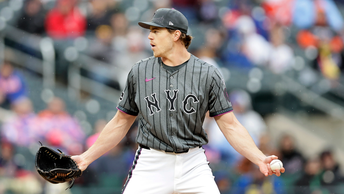
3/New York Mets ‘NYC’

GettyNew York Mets Pitcher Josh Walker
All things considered, I find the NYC layout way too cozy a design in comparison to what their Bronx counterparts have donned for over a century.
Honestly, the best part of the scheme for me is the addition of the purple and I concur with Kepner that, “They should have leaned into the purple a little more, especially for the cap emblem.”
“Why go with “NYC” across the chest? “Queens” is right there. It’s only faintly Metsy. And it’s a flop, for me,” said Nesbitt.
“Flop” is a great descriptor in my book.
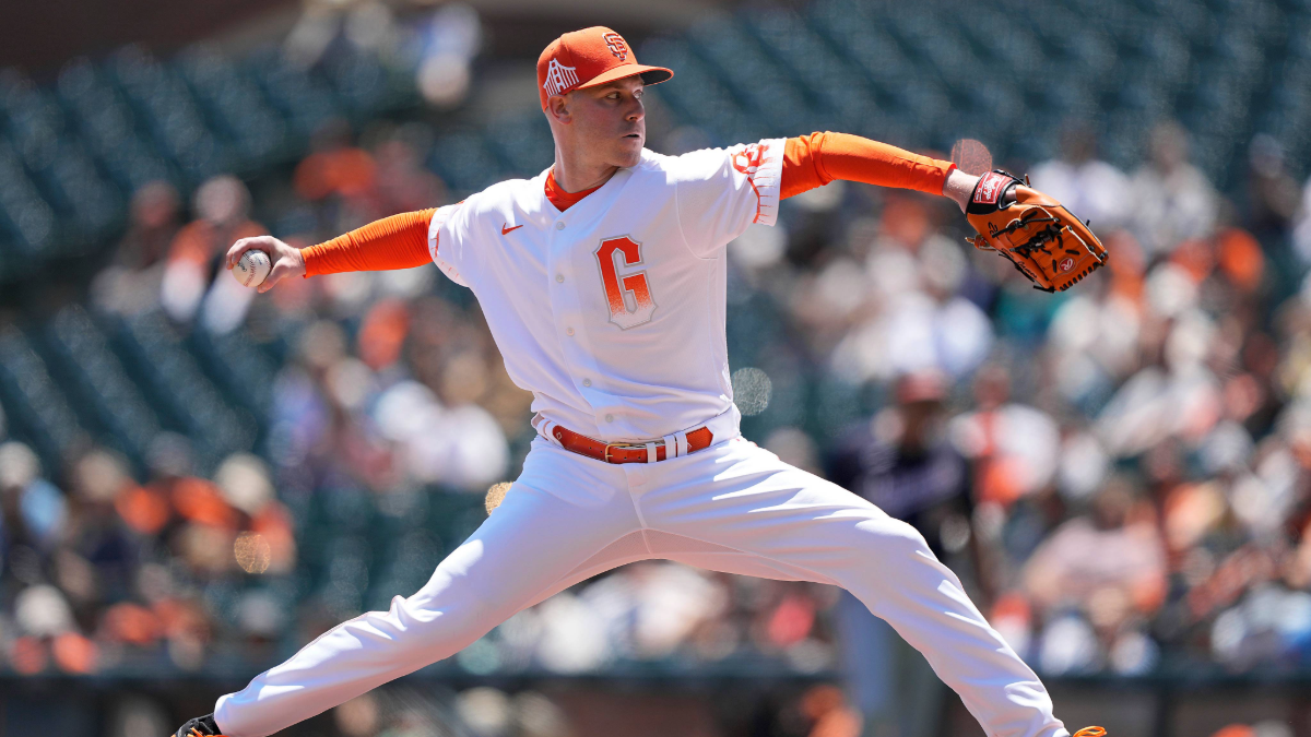
2/San Francisco Giants ‘G’ Men

GettySan Francisco Giants Pitcher Anthony DeSclafani
Perhaps the most unassembled uniform of all is the San Francisco “G” entry. The attempt at creating a fog element coupled with the color palate and oversized G takes on a cheesy-esque feel about it.
“Devastatingly poor execution. Using fog as a gradient theme is, in theory, an inspired choice. But these come out looking awkward and cheap. The bridges look bad. The fonts of the “SF” and “G” logos clash. It all just looks like a big L,” says Nesbitt.
Jones added, “Players look like containers of orange sherbet on the field.”OUCH! More like one of those creamsicles, but still accurate.
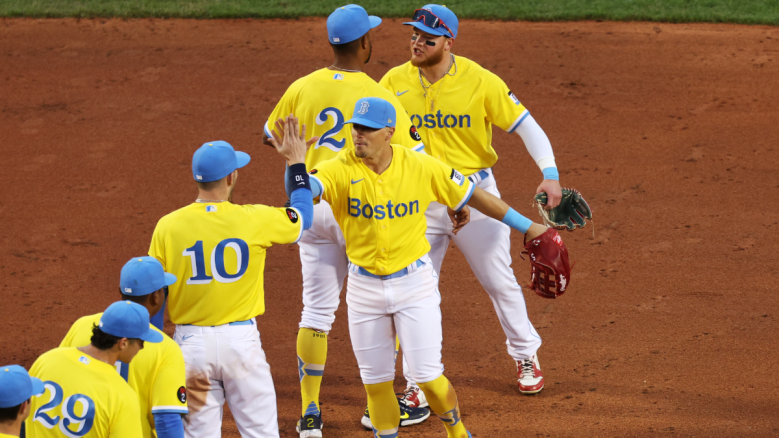
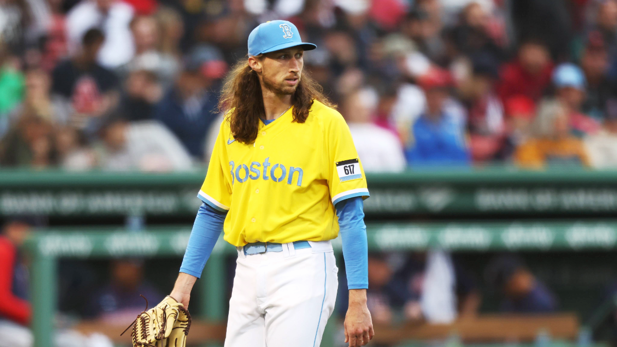
1/Boston Red Sox ‘Maraton-Colored’ Entry

GettyBoston Red Sox Pitcher Matt Strahm
The Athletic contributors all seemed fairly accepting of the “bold” colors of Boston’s world-famous marathon but agreed other Boston inspirations could have been considered.
“I like that it’s completely different and is more about the city than the ballclub,” said Rosencrans.
“Yes, these are the colors of the Boston Marathon,” said Kepner. He added, “And it’s out of step for a city and ballpark with many more sources of inspiration.”
“No red on a Red Sox jersey is bold. I’m sure there’s a UCLA alum somewhere with this cap who doesn’t care that it represents Boston or has anything to do with the Boston Marathon,” wrote Jones.
No red is a snap-fail for me. The first time I saw these colors I thought the Red Sox were having a weird Brazilian soccer team night giveaway or something similar. This is easily my least favorite.
Top-Three Time in the City
3/St. Louis Cardinals ‘The Lou’
Any novelty that includes the amazing Birds-on-the-Bat design usually passes my eye test. With the St. Louis Cardinals being a classic risk-averse franchise, why not take the same approach with the uniforms?
“Having studied all 28 designs, I’ve come to appreciate a safe approach,” said Nesbitt.
“This Cardinals jersey resonates. This isn’t overly creative and I’m fine with it. What can I say? City nicknames on City Connect jerseys work for me,” said Jones.
On the contrarian side, Kepner wrote, “While the younger demographic in St. Louis might use the phrase “The Lou,” to everyone else, it means “the bathroom.” First off, that version is spelled Loo, but I’ve never heard anyone utter that in public. Plenty of to the John and the Head, but no Loo or Lou (smile).
The fleur-de-lis logo on the sleeve was a nice touch in recognizing the river city’s French heritage. However, not having the Gateway Arch behind the “STL” on the hat was a big misstep in my view.
Overall though, #ForTheLou and #STLCards are represented well in this package.
2/Washington Nationals ‘Cherry Blossoms’
The pink and gray arrangement works nicely here, and after you read up on the cherry blossom connection, it all coincides well.
“These two [colors] work in harmony on this gorgeous set (if they’d just used “DC” on the breast, it’d be an easy No. 1 for me.),” intimated Rosencrans.
“Cherry blossoms work perfectly here — distinctively D.C. and a new element to a baseball uniform,” said Kepner. He added, “Don’t love “WSH” though.”
Likewise, I agree that “DC” or a vowel would have worked well in there. But in the final analysis, this could have easily been my number one choice.
1/Miami Marlins ‘Havana Sugar Kings’
Like a front-running sprinter about to conquer five furlongs on the backstretch, the Marlins came busting out of the gate with a sweet, slightly altered tribute to the 1959 Havana Sugar Kings.
The boys who contributed to this Athletic piece all loved this uniform, and I’m on the bandwagon as well.
“Crown logos are a nod to the Havana Sugar Kings. It’s bold and it works,” offered Nesbitt.
“I’m a sucker for jerseys with heavy historical connections. The nod to the Havana Sugar Kings is a winner here,” said Jones.
“Wonderful. No notes. Better than what they normally wear and anything they’ve worn before,” writes Rosencrans.
A combination of red jersey and white pinstripes with blueish pastel shadows is my overall winner of the 2024 MLB City Connect unis.
In conclusion, there were many on the cusp of making my good and bad top 3, but for the sake of ADD sufferers, I had to draw the line somewhere.


Comments
Critiquing The Athletic Critics: The 3 Best & Worst MLB City Connect Uniforms