The NBA teamed up with Nike to unveil their new ‘Earned Edition’ jerseys which were revealed on Wednesday. The new uniforms are specifically for the playoff teams from last season. Meaning there are 16 looks which will be worn at various points throughout the remainder of the season.
Specifically, Nike explained that the jerseys will first be debuted on Christmas Day (for the teams who play). The other teams will wear the uniforms in games shortly after that. With the looks being a modification of the ‘City Edition’ jerseys, there are some obvious similarities, but we’ve gone through and ranked each of them
Let’s start things off with the Boston Celtics. Kyrie Irving and company seem to have a look that just captured what many envision when thinking of this team.
1. Boston Celtics
The Celtics new jerseys have been on point this season 🔥
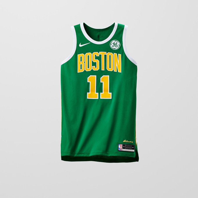
The decision to go heavy on the green was a great call here with the Boston Celtics jerseys. It’s a look that stands out and is attention-grabbing as well. I may be a bit biased here, but when looking through the list, this jersey caught my eye immediately.
2. San Antonio Spurs
LOOK: Spurs ‘Earned Edition’ jersey revealed t.co/0hyJGIUJP8 #GoSpursGo #NBA

There have been mixed reactions to the San Antonio Spurs’ look, as the camouflage certainly isn’t for everyone. It’s incredibly unique and stands out, which is why I’m not surprised some aren’t a fan.
3. Cleveland Cavaliers

I debated pushing the Cleveland Cavaliers up higher on this list, as the approach Nike took to this look is unique and creative. It stands out, but also isn’t too over-the-top, and that’s not something that’s easy to do.
4. New Orleans Pelicans
Other teams: t.co/3Yhk9eCvkJ

The New Orleans Pelicans are another team who likely deserved to land higher up on the list than this. It was tough to justify putting them at No. 4, but the teams above just had my attention and never lost it. Regardless, Anthony Davis should have no problem pulling this off around Christmas time.
5. Indiana Pacers

This is fairly straightforward but gets the job done. The word “slick” is probably best to describe the Earned Edition look for the Pacers. I’m a big fan of the blue streak down the side that gets larger as it goes.
6. Miami Heat
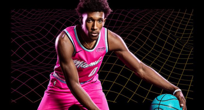
These are really awesome and incredibly unique. It’d be tough to fault an NBA fan for arguing that this is a top three or four jersey out of the entire collection. The ‘City Edition’ look for Miami which featured a black backdrop with pink and blue lettering was unique, but this is great.
7. Minnesota Timberwolves
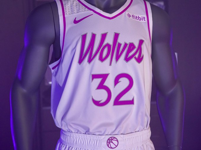
Simple, yet sleek got the job done for the Minnesota Timberwolves. I’m not obsessing over it, but I like it enough to put it in the top-10. There’s something unique that stands out about the all-white with a touch of color added in.
8. Milwaukee Bucks
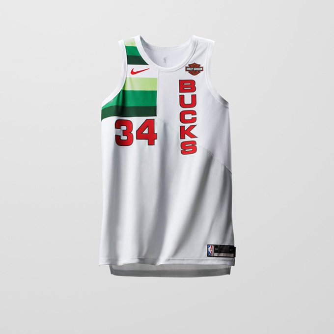
Maybe I’m just a fan of when NBA teams opt to flip their name and toss it on a jersey vertically because this looks good. Although I’m a fan, I think the Heat and Timberwolves jump out more than the Milwaukee Bucks, which is why they came in at No. 8.
9. Portland Trail Blazers

For complete transparency, it should be known that the whole “Rip City” sell is one that I’m on board with. It’s a great nickname and I think the jersey is flashy, but they didn’t do quite enough with it. If they had gone one step further, the Blazers could have jumped quite a bit.
10. Utah Jazz

For the Utah Jazz, I do like the green approach, as it’s unique. Beyond that, the way the number meshes with the logo stands out as well. The jersey as a whole just catches the eye, but it’s not quite enough to push up higher on the rankings.
11. Golden State Warriors
Introducing the Nike NBA Earned Edition Jersey
‘The Town’ mantra is something that’s been embraced and looks good here. The colors work and it stands out, but it’s not as over-the-top as some of the choices above. In turn, it was hard to push this up higher.
12. Oklahoma City Thunder
👀👀👀

I do like the look of the Oklahoma City Thunder’s Earned Edition jersey, but there wasn’t enough that stood out to do much here. It’s a good-looking uniform, but nothing overly flashy or exciting.
13. Toronto Raptors
Thoughts ?

It’s not hard to jump on board with the Raptors look at first glance, but something about it is just kind of plain. The concept is cool and the actual layout of the jersey looks good, but there’s something missing here.
14. Philadelphia 76ers
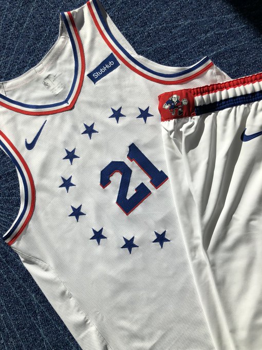
I do like the Philadelphia 76ers’ jerseys, but they seem to be almost the exact same as their City Edition jerseys except they’re white instead of grey. The white is a cleaner look, but it’s not going to shake the NBA.
15. Washington Wizards
Similar to the Sixers (unless I’m mistaken) the Earned Edition jersey for the Washington Wizards is basically a change to red from black when looking at their previous jersey. It’s not a bad look at all, but it’s not going to wow anyone.
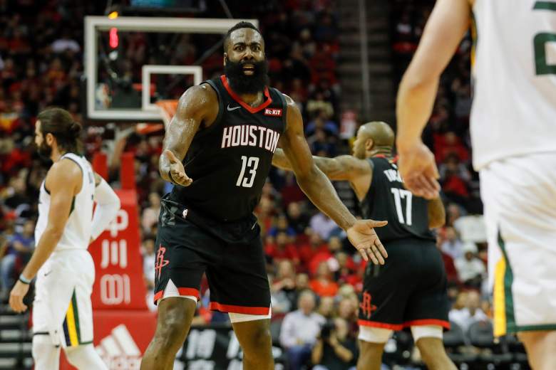
16. Houston Rockets
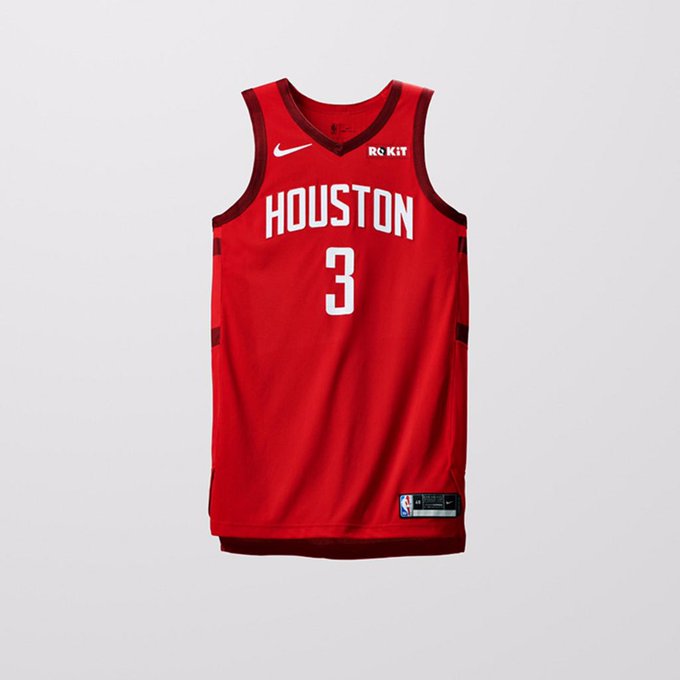
Going from the black jersey to red is good, but the Rockets look could have added a bit more I think. It’s a nice looking uniform, but similar to the other options at the bottom of this list, they don’t jump out like some of the others do.
READ NEXT: Kevin Love Trade: Rockets & Blazers Linked, but It’ll Cost Them
NBA Earned Jerseys: Ranking Nike’s New Uniforms From Best to Worst