We predicted this would happen and it came true. The third version of Apple’s new mobile software arrived today. iOS 7 Beta 3 has just been seeded to developers with several improvements and new features. Here are 10 of the best features and updates you need to know about.
1. Fonts Have Been Altered
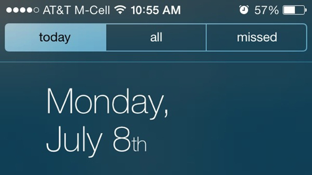
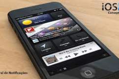
MacRumors reported that the type-face in the homescreen had been changed. The adjustment has made it easier to read throughout the system. In the image above, the font appears thicker on the home screen, notification center and most notably the messages page. Macrumors mentions that the new style is Helvetica Neue Regular instead of the original Ultra Light. This GIF provides the best example of the font changes. The purpose of switching the fonts may have been intended to address the lack of visibility it had in iOS 7 beta 2.
2. The .Com Button Has Vanished From Safari
This additional extension was a nuisance for many beta testers. They claimed they would hit the button instead of the space bar which would ruin the message they were writing. Apple Insider notes that this was a remnant of previous versions of iOS and in its place is now a simplistic period button. Users can now hold down on the period key to get the .com button back as well as .net, .org, .com etc. This still keeps the basic functionality on the keyboard. Safari also has some slight User Interface tweaks for tab/bookmarks on the iPad and in the loading bar in the iPad/iPhone.
3. Calendar Dots Are Back

Calendars now utilize gray dots to mark events. This feature was lacking in previous versions of iOS and the first two betas didn’t contain this either. From your phone or tablet, all you need to do is click on the day icon. The dot appears with the information you need to know including address and reminders. It’s a simple touch but it works for the calendar.
4. Status Bar Has Increased In Size
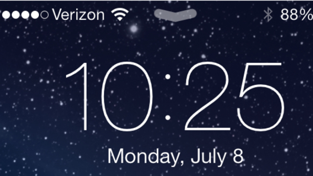
Adding another alteration to the home screen is the status bar. This increase in size helps handle the clutter when your phone is locked. Icons for battery power and signal strength crowd the display so this is another idea to distinguish itself. Also, the lock screen can display music and album art as it plays. Controls and time are all set to be viewed simultaneously. This is a better interface compared to the second beta. The previous method did not show the time unless music lovers pasued their favorite songs. Overall, the combination of the screen features and bolder text make it easier to read and better to use.
5. Double Notifications Have Been Fixed…For The Most Part
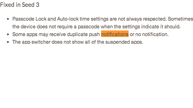
This was a big issue in the previous beta versions. Notifications were getting sent twice and there seemed to be no solution for this problem. Some apps contained these bugs but the tool known as the app switcher displays the suspended apps. This is a good start for the third beta since it removes one of the biggest issues. iOS 7 Beta 3 has done a good job so far of removing pesky issues like this and has provided an in-depth understanding of the errors they corrected.
6. New Animation Added For Apps

Downloading apps from the app store was a pain on the other versions of the betas. The third one has a new animation. A clock appears at the top of the screen indicating how much time is left for the program to load. This shortcut reduces stress in case the app is needed for something important. The clock icon is a good substitute for a download bar and gives a better illustration of installation time. This tool can support app developers can use this feature to refine and improve memory in their programs.
7. Battery Animation Got Removed
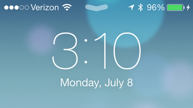
App advice discovered that the charging animations have vanished. Typically, the iPhone/iPad/iPod would have the lightning bolt symbol pulse next to the battery sign. This was another unique visual cue about how much energy the product would have left to gain a full charge. Now, App Advice notes that the lightning bolt does not move. It’s stationary. I would not consider this a huge loss.
8. Control Center Clock Design Returns
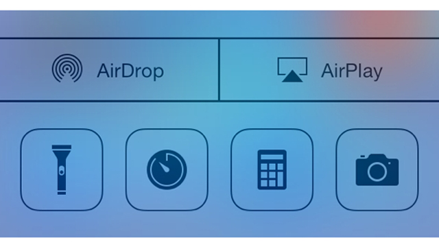
Beta 2 removed the current clock in favor of a thinly outlined version according to MacRumors. Seen in the image above, the new clock has come back in the original dark format. The original version of control center included the ability to connect to Airplay over iOS and other features. We will update you once we get more updates on if this is the only change to control center for beta 3.
9. Mail Has Been Completely Remodeled
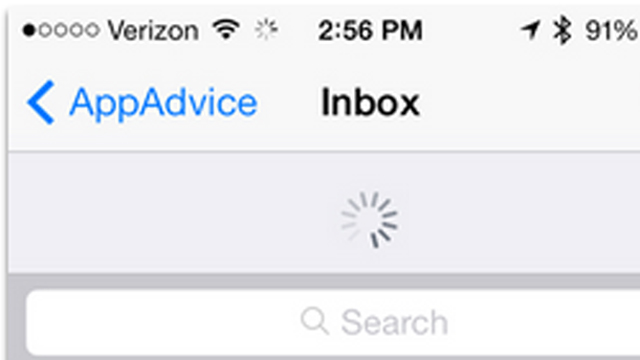
App Advice divulged another interesting new facet of the beta. When you pull down on the screen to refresh in your mailbox, the beta has a new animation to show its connecting to its source. A new search bar has been incorporated too. I like this addition since searching for important e-mails can be difficult for phones. Unless you type in a specific search, the function returns a massive amount of results.
10. Will This Be The Last One?
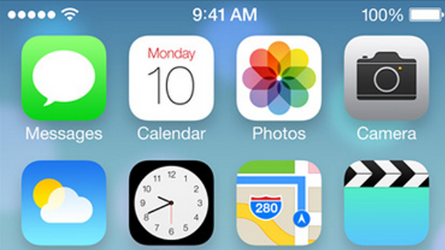
The answer is most likely yes. Apple is known for releasing several different versions of the OS before they deliver the finished system for new products. Rumors have circulated for awhile that new designs for the iPhone and iPad will be arriving this fall. If this information turns out to be true, the company may not have enough time to seed another version. The third beta has done a good job of addressing the bugs found in the previous version. It shows that Apple cares about what the developer community says. For more information on the program, lucky downloaders and developers can find it here.
Comments
iOS 7 Beta 3 New Features: Top 10 Facts You Need to Know