(Google)
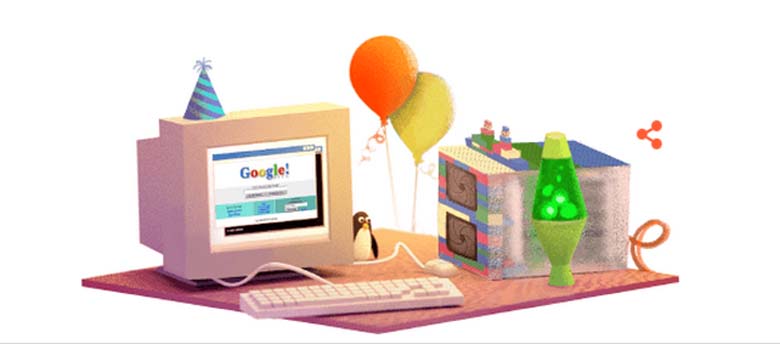
On September 27 Google wants you to celebrate their 17 birthday. The company is celebrating the seemingly random number with such gusto because “In the world of computer programming, 17 is widely considered the least random number.” So Sergey Brin and Larry Page are starting the party by unleashing a Google Doodle on the world (except in the U.S.) The reason for the doodle’s lack of presence is likely down to Google’s “Gameday” doodle they’ve been using on NFL Sundays.
Here’s what you need to know about Google’s birthday:
1. Google’s First Server Was Made of Toy Building Blocks
(Google)
In a blog posting on the day of Google’s birthday, the company wrote:
To assume we made it this far without a little luck, though, would be like assuming lava lamps, turtlenecks, and servers held together by building blocks are harbingers of success. For our 17th birthday, we offer a glimpse into our humble beginnings, when branded hockey jerseys were cool and Savage Garden had a number-one single.
They then go on to share some classic photos of the first servers the company used in Larry and Sergey’s Stanford dorm room, it was made of toy blocks, it’s pretty cute. There’s also photos of the first Google team, and lava lamps, which seemed to common on 90s work desks.
2. Google’s Original Designer Said She Wanted the Logo Look ‘Almost Non-Designed’
In the video to celebrate the release of their new logo earlier in September, Google notes that since their first logo back in 1998, it has constantly been evolving. The original logo was designed by Ruth Kedar. She explained her creative thought process:
It was playful and deceptively simple. The design subtle as to look almost non-designed, the reading effortless. The colors evoke memories of child play, but deftly stray from the color wheel strictures so as to hint to the inherent element of serendipity creeping into any search results page and the irreverence and boldness of the “I am feeling lucky” link. The texture and shading of each letter is done in an unobtrusive way resulting in lifting it from the page while giving it both weight and lightness. It is solid but there is also an ethereal quality to it.
She later spoke about her color choices: “We ended up with the primary colors, but instead of having the pattern go in order, we put a secondary color on the L, which brought back the idea that Google doesn’t follow the rules.” The evolution of Google’s design is discussed at length in a new site created by the company.
3. Google Just Launched a New Logo, a Month Before Their Birthday
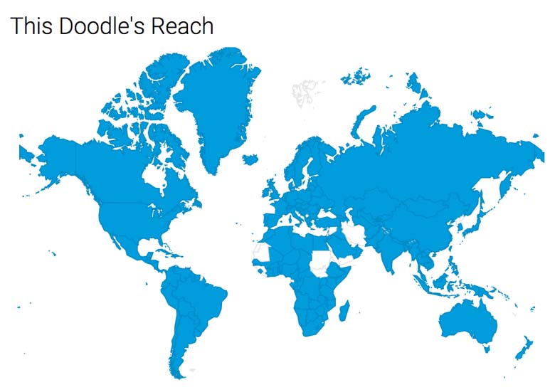
The reach of Google’s latest doodle.
Of course the company is using its Google Doodle platform to help spread the word about the new logo. The doodle is present in most countries in the world. A nice animation first shows the old logo, and then a hand appears and wipes it out, making way for the new one. The very first doodle in 1998 came about when Google’s staff went to party at Burning Man and left the doodle as an elaborate out-of-office message.
For those of you who would prefer to read about Google’s birthday in Spanish, step this way:
4. Google Used to Have an Exclamation Point
(Getty)
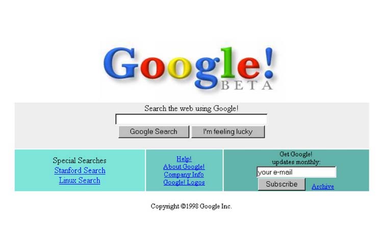
The last logo had been in effect since September 2013, which showed the logo in a more two dimensional or flat way. It underwent a very slight change in pixelation in May 2014. Creative Bloq noted that the change was “all but invisible to everyone but typesetting enthusiasts.” It could be argued that the September 2015 new logo represents the biggest departure for Google since 1999 when the exclamation point at the end of the logo disappeared.
A Brief History of the Google Logo:

1997: Google’s pre-launch logo.

1998: Larry Page and Sergey Brin use this logo for their Stanford University graduate project.
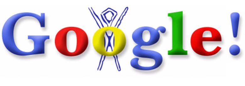
August 30, 1998: The team heads to Burning Man and creates the first Doodle as an out-of-office message.
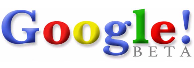
September 1998: Google moves to google.com and shares its beta release with the world.
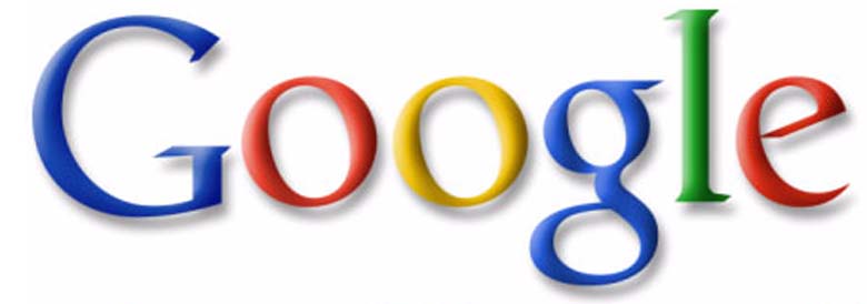
May 1999: Still playful, the logo gets a more sophisticated look based on the Catull typeface.
May 2010: The logo brightens up and sports a reduced drop shadow.
September 2013: The logo goes flat with some typographical tweaks.

September 2015.
5. Google Was First Known as ‘Backrub’
(Twitter)
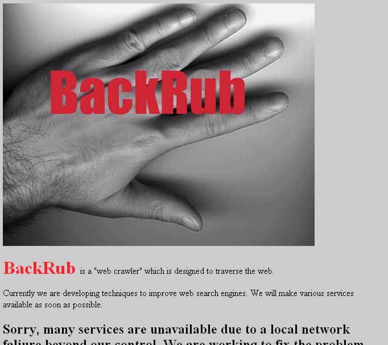
Back in 1996, when Google was known as BackRub, it had a more sensual, less cartoony logo showing a hand stroking a bare back. The odd name stems from the search engine’s use of backlinks to rank the importance of a website, a pioneering innovation.
It was a year later when Larry Page and Sergey Brin rolled out the first Google logo.
