
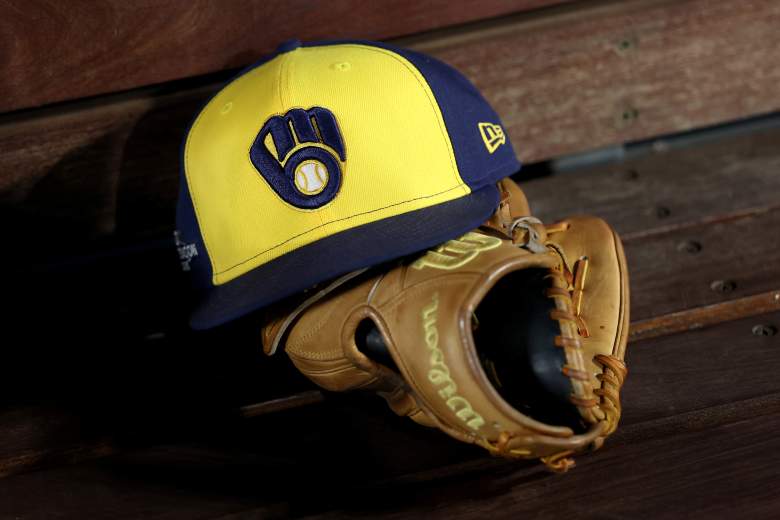
The Milwaukee Brewers are back in the World Series for the first time since 1982.
In fact, the last time they played in the Fall Classic, they represented the American League. It’s been a while.
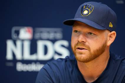
And with the Brewers return to the Fall Classic comes a national stage for one of the coolest yet most underappreciated logos in sports.
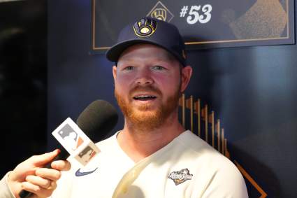
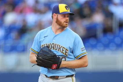
The Brewers’ glove on their hats is much more than a glove.
What is the Brewers’ Logo?
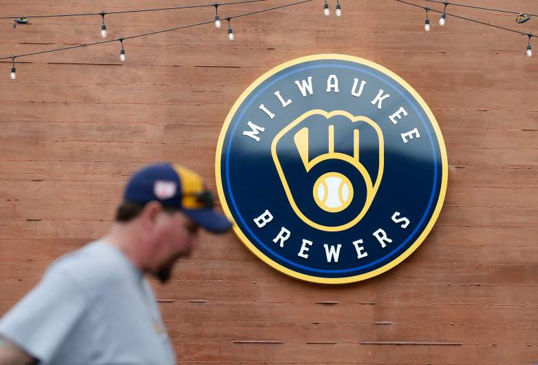
At first glance, the Brewers’ logo looks like a baseball glove with a baseball in it.
That’s correct.
It’s also a pair of letters, though.
If you look at the logo more closely, you can see it. The top segment of the logo is the letter ‘M,’ displayed a bit more in its lowercase version. And then the bottom segment of the logo is a lowercase ‘B.’
When you form that ‘m’ and ‘b’ together in just the right way, it looks like a baseball glove. Add in the baseball, and it’s the perfect logo.
Milwaukee Brewers Logo History
The Brewers have mixed up their logo usage through their history.
“Designed in 1977, (this) logo debuted in 1978, was abandoned in 1993, reappeared in 2006 and was officially reinstated as the team’s primary logo in 2020,” The Athletic’s Devon Henderson wrote earlier in October.
The origins of the logo date back to the days when the Seattle Pilots relocated to Milwaukee.
“The Seattle Pilots franchise moved to Wisconsin in 1970 and hadn’t had a winning season when the team announced a fan contest in 1977 to create a new logo,” Henderson wrote. “After a 95-loss season, the Brewers looked to spark change and inject new energy into the franchise, and fans responded with more than 2,000 entries.”
Tom Meindel’s design won, and he used the $2,000 prize for a down payment on his house, according to The Athletic.
And then the Brewers started winning.
“Its introduction coincided with a turning of the franchise’s fortunes,” Henderson writes. “After the rebranding, the Brewers won 90 or more games in three of the next five seasons, culminating in a 1982 World Series appearance that they eventually lost in seven games to the St. Louis Cardinals.”
Milwaukee will be hoping that its logo can lead to even more winning in the 2026 World Series.
The franchise hasn’t played in the Fall Classic since that 1982 edition, when they were also wearing this ‘m-b’ baseball glove on their hats. It’s about time for Milwaukee to throw those hats to the sky in a World Series celebration.




Milwaukee Brewers Logo, Explained: Why Glove Has Double Meaning