
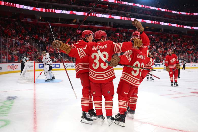
On Nov. 2, the NHL released its Hometown Remix jerseys. The Detroit Red Wings‘ look was one of the best in the unveiling.
The Red Wings carry one of the NHL’s most traditional looks, and that continues to be reflected in alternate uniforms. One that fans will ultimately see on the ice.
Nicholas J. Cotsonika shared on NHL.com that “Each team will wear its Hometown Remix uniform several times this season, starting with the Florida Panthers, Chicago Blackhawks and San Jose Sharks on Monday.”
Unlike many of these newly released jerseys, few can claim that they stuck to a traditional look so well.
Detroit’s Hometown Remix jersey isn’t much different from their typical home jersey. It has a red base, a white collar, a thick white stripe on the arms, and a white stripe at the wrists. Another white stripe runs around the sweater’s bottom hem.
The famed Winged Wheel is present, with Hockeytown emblazoned across the top in a small arch. That is it on the no-frills design that sticks to Detroit’s brand.
Red Wings Didn’t Need To Reinvent Their Identity
While some fans wanted to see something more elaborate, the real question is: Why reinvent one of the league’s most distinguished and recognizable looks?
Plus, the Red Wings proved during their 100th anniversary celebration that they don’t need to radically depart from their current design to be successful. Their current alternate uniform worked last season, and it is working again this season.
Detroit wasn’t the only team to understand the assignment. Others, like the Boston Bruins, went with a simple design in old-school colors (brown and gold). The Los Angeles Kings did something similar, emphasizing more purple and gold. The Buffalo Sabres unveiled a goathead in their current blue and gold color scheme with simple gold and white striping.
Many of these jerseys looked questionable, to put it generously. They either did not incorporate their current (or a former) color scheme well, put way too much emphasis on darker colors (like graphite and/or black), and many have striking similarities. In other words, there isn’t enough contrast between most of these looks.
It is reminiscent of the NFL’s Rivalries Program, where many teams deviated from their recognized brand by overdesigning or reimagining the uniforms.
Detroit’s Simplicity Is Its Advantage
If there is any criticism regarding the Red Wings’ Hometown Remix look, it is that the Hockeytown wordmark could be competing for time with the Winged Wheel. Still, this is a small would-be critique for a uniform that even those who don’t typically follow Detroit hockey would realize as a Red Wings jersey.
That gives Detroit a massive advantage regarding its historical brand. For some of these jerseys, it was tough to recognize who was who unless one looked closely at the logo emblazoned on the sweater. In some cases, even that didn’t solve the mystery.
Kudos to everyone involved in designing Detroit’s simple but winning look. It is the kind of jersey the Red Wings could realistically use as an alternate beyond the Hometown Remix era if they so chose to.













Red Wings’ Hometown Remix Jersey Gets Something Right That Much Of NHL Missed